After more than 40 years of operation, DTVE is closing its doors and our website will no longer be updated daily. Thank you for all of your support.
Q&A: Alexey Zaberezhniy, video solutions system analyst, Oxagile, on ways to maximize viewer lifetime value
To hook users with clickbait videos or achieve a one-time ARPU effect is a technically straightforward task for the swelling ranks of video content aggregators. A tougher nut to crack is acquiring a truly loyal viewer who willingly re-subscribes again and again every month, or on whatever terms the online service offers.
Are there any lifehacks to continuously multiply the number of loyal subscribers of a streaming platform? What are the tips for standing out among other online video services so a user always feels confident about their choice? Alexey Zaberezhniy, Oxagile’s video solutions system analyst, discusses the topic of must-have online video service requirements, an impeccable user experience, and interactivity tweaks – all in the context of building long-lasting relationships with users.
 If you had to create a formula for an online video platform that’s second to none in retaining subscribers, what would it look like in detail?
I’d rather use the terms “basement” and “building blocks”, as there are some cornerstone elements that make a competitive OTT service, while choosing the right bricks to design the platform distinguishes you from others in an advantageous way.
The first part of the basement is technological excellence. Today, one can’t call oneself a quality media streaming service provider if one doesn’t ensure seamless access to the content or smooth content playback without freezing of video streams. Regardless of the volume of investment, if the technical quality of a streaming service leaves much to be desired, the platform is likely to be stillborn.
Plus, many technological aspects have already become part of a basic category, like multiscreen video, catch-up functionality, adaptive streaming or DVR, thus making it more challenging for content aggregators to stand out in the market from a technical perspective.
So, what will help them stand out then? Giving premium content to their subscribers?
Content turns out to be the second foundation of the online video service that will really distinguish you – none of the strategies for attracting customers will work if you have three content items in your streaming portfolio.
As for presenting one-of-a-kind titles, that’s a big deal, but be aware of the minefields on the way. There is a finite amount of content produced, which becomes a reason why one content offering hugely overlaps with its rivals. I mean you’re unlikely to delight a demanding viewer with the latest movie, if the competitive streaming services offer exactly the same.
Exclusive content is king, but what about the cost of its creation? Very few online video market players can allow themselves to follow the path of producing unique content.
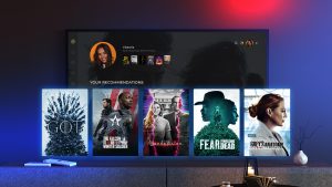
After the foundation made from quality technology and a vast variety of content is laid, here comes the next step – to demonstrate that your service is all about convenience and ease of use. The key secret here is as follows: “If you grant a viewer’s wishes in two clicks, the subscription to your service will join the list of their recurring payments.” A smart recommendation system coupled with an intuitive interface is an element requiring action, which will let video services gain and retain their audience.
What makes this promising recommendation system you’re talking about stand out?
An analytical system is a key component for a video content service provider that intends to give viewers what they really want, avoiding imposing the same-type of content.
Monitoring TV viewing profiles, applying audience hyper-segmentation techniques, and evaluating viewer behaviour helps transform huge volumes of data into smart suggestions for a particular cohort or even individual.
If a user thinks of your service as a showcase for the right content, it won’t be an issue to inspire them to choose any of your packages or subscription options, whether it be SVOD, TVOD, or hybrid formats.
You’ve been talking about viewers whose TV viewing profile already provides massive data sets to analyse. What if a subscriber is new to a service and there’s no info about his previous watch sessions or preferences?
That’s the ‘cold start’ problem. Obviously, it’s impossible to astound a newcomer with individual recommendations that will be right on target. The path of least resistance is banking on trending or popular suggestions, but it has nothing to do with personalization.
Another scenario we implemented for one of our OTT clients could be called “100 hours of watch time.” Each new subscriber is informed that the service is remarkable for its recommendation system, and the only thing they need to do before reaping all its benefits is to enjoy 100 hours of video content that interests them and is available on the platform.
While the wait keeps them anticipating and excited about highly personalised content suggestions that are just around the corner, the system actively gathers actual data to provide foolproof sport or movie-related recommendations.
What else keeps the attention of users before they benefit from personalised content recommendations?
The answer will be a well-thought-out UI alongside the analytical system as a must-have element for enabling the recommendations that work. But of course, the role of user interfaces isn’t limited to deepening a positive impression from smart content suggestions, because if a user is getting lost in an abundance of elements or a tricky navigation experience from the start, he or she might never get to the point of choosing a movie.
Let’s go back to recommendations to see the significance of user interfaces. Even if the analytics algorithms are impeccable, how high are the chances that a viewer stays by your side after numerous failed attempts to find a much-desired programme category? If users are puzzled by the navigation elements and can’t spot the right button in a split second, their growing irritation and dissatisfaction will hardly lead such a service to win the title of “the first important screen in the household.”
Here are some tips to conquer a smart TV screen, which represents the major challenge in terms of the UI. The ideal scenario we’re striving to deliver going live with OTT front-end solutions could be described as “getting to any content goal in two clicks.”
Among the killer features to avoid a cluttered interface and users confused by poor focus and a requirement for numerous actions are:
- Interfaces appearing in the right place at the right time
When it’s enough to press an “OK” button to get what you want instead of surfing menus, tabs, and drop-down lists, it’ll add a couple of points to satisfaction from comfort watching.
- Leveraging companion devices to enhance the experience
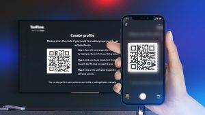
Multi-device usage is another proven way to minimise the number of actions on the users’ side. The convergence of platforms and the excitement of watching the content on a big screen go hand in hand – you simply take your mobile phone, and in a couple of seconds, after two or three simple actions, get what you‘ve been looking for on a TV screen.
- Voice search
This feature speaks for itself – sometimes, there’s no need to type at all. This makes the objective of getting to the content in two clicks not so challenging, which is an especially hot topic for smart TVs.
- Interactive viewing
Value-added features like polling as part of the TV viewing experience or interactive betting during live sport streaming kill two birds with one stone, leading to the accumulation of data about users’ preferences while making their viewing time more engaging.
Why not ask directly about what they like and what they don’t to generate targeted recommendations quickly?
And there lies the third brick making up a comprehensive recommendation strategy. Getting feedback from users might inspire them and give an extra boost to their loyalty, as they feel you really care about their thoughts, tastes, and choices.
Guessing the right moment to ask for likes or dislikes is another issue – when the system intrudes on the viewing experience with requests to rate the content, there is a risk of provoking a negative reaction instead of honest opinions about the content consumed.
On the other hand, if you manage to kindly nudge viewers to leave feedback in a timely and non-intrusive manner, on top of acquiring data to analyse, you’ll have a chance to win the favour of the audience.
Alexey Zaberezhniy is a video solution system analyst at Oxagile, a custom software development company with 17 years of expertise in the online video domain covering frontend OTT app and backend software development, end-to-end system integration, and innovation technology enablement (machine learning and data intelligence).
Alexey is primarily focused on interactivity and personalisation trends bringing value to video streaming consumers. The areas of his project experience include enabling multi-device use, interactive viewing experience, extended UIs, smart recommendations, discoverability of content, etc.
This is sponsored content.


