After more than 40 years of operation, DTVE is closing its doors and our website will no longer be updated daily. Thank you for all of your support.
Characters front-and-centre in Netflix Kids redesign
Netflix has revealed an overhaul to its Kids profiles.
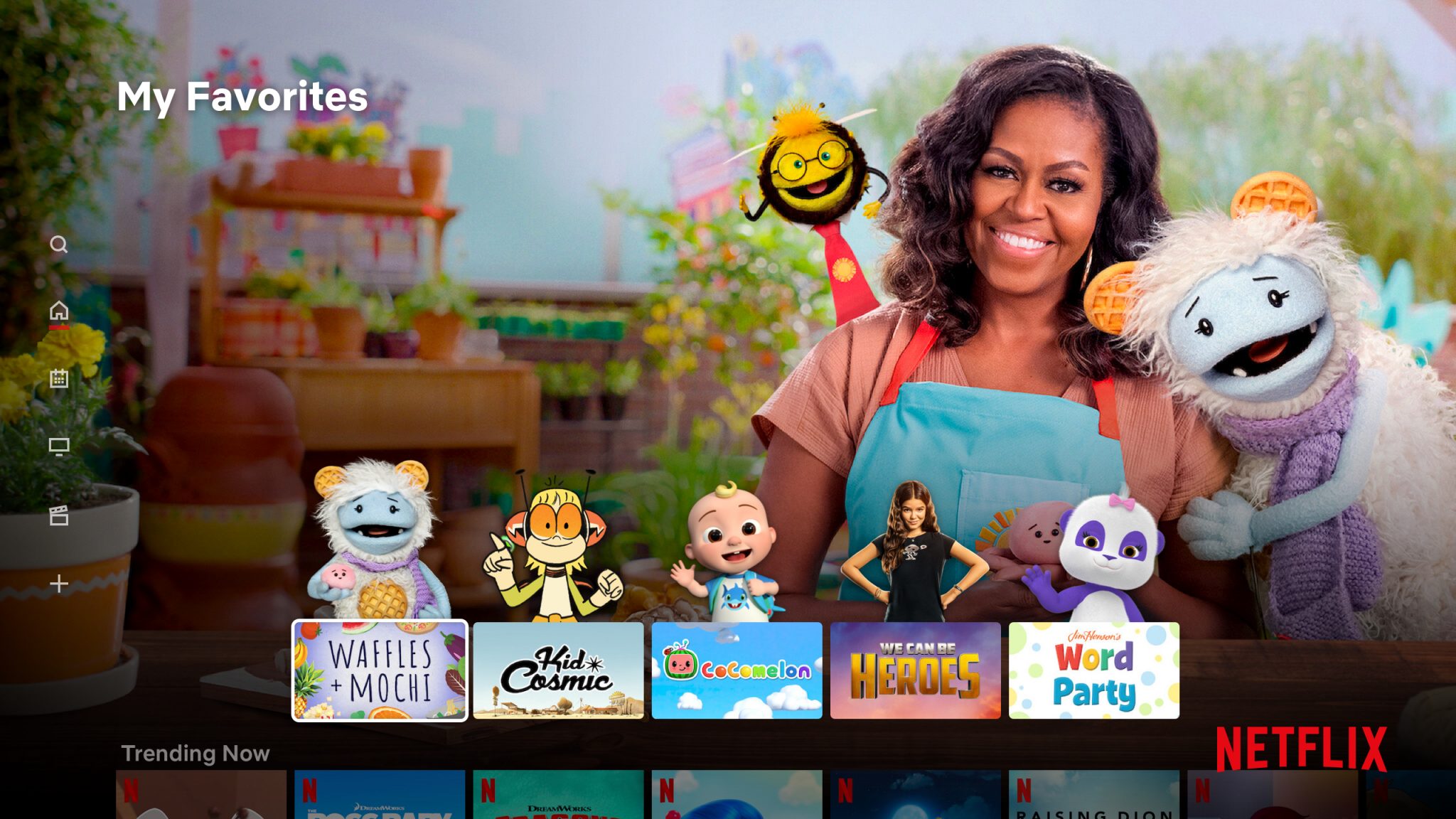
By contrast to the old Kids profiles (which were effectively just content-restricted versions of the normal adult profiles) the complete redesign follows the lead of other streaming services like Disney+ in putting a greater focus on characters and recognisable imagery from the shows.
Upon launching Netflix into a Kids account, a user will be presented with a row of their most-watched shows, with characters from the shows appearing on top of the title box. Netflix said that it populates this row with all child friendly content – not just its originals – that has been watched at least once by the user.
Complementing this, the background will update to reflect the chosen show.
In comments to Variety, Netflix product manager for kids and family Michelle Parsons explained that “This is going to be like a kid walking into their own room, where they know where every Lego piece is.”
The exec added that Netflix previously tested the character-based favourites row and that it was popular with children, but did not say how much the redesign impacted time spent on the streamer,
Not changing in the redesign is Netflix’s parental controls settings. None of the controls and settings initially applied by a parent to a Kids profile will change, Netflix said.
While the most popular streaming service amongst adults, Netflix has increasingly found itself fighting for kids’ screen time over the past 18 months since the launches of rival streaming services. Disney+, with its rich library of iconic kids movies and shows (read: the ability for a two year old to watch Frozen on repeat for the 15th time this week) has the edge at present, but Netflix will continue to invest in catering to younger audiences.


