After more than 40 years of operation, DTVE is closing its doors and our website will no longer be updated daily. Thank you for all of your support.
Sky revamps Sky+ Homepage
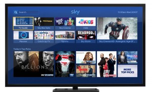
 Sky has launched a new design for the homepage of its Sky+ connected TV platform, designed to help customers discover “even more TV to watch”.
The update introduces editorial ‘Top Picks’ to the Sky+ Homepage, offering recommendations – based on users’ subscriptions – about the best new programmes, boxsets, sports highlights, kids’ shows and movies.
Other new features include a ‘Download next’ function, which automatically downloads the next episode in a boxset when viewers watch a series; and a ‘Continue watching’ tab in the planner that lets users pick up where they left off.
“Since the homepage was launched on demand viewing has increased by 209%. That’s why we’re introducing Top Picks, a brand new homepage section, telling our customers about even more fantastic shows, both live and On Demand, recommended by our TV experts,” said Sky’s director of TV and content products, Luke Bradley-Jones.
Other changes added in the update are a newly designed ‘Services Homepage’ to help customers to customise the Sky Guide; a ‘Viewing progress bar’ in the Planner showing how much of a programme has been watched; a new Radio tab in the TV Guide. The search tool is also now located at the top of the homepage. The software update is will be available to millions of homes with compatible Sky+HD boxes by the end of August, according to Sky.


